10 Most Common Mistakes on E-commerce Websites

Good user experience is a basic need for any online shop because it leads customers to a pleasant shopping experience. If it’s a bad experience, it may frustrate them, and customers who get frustrated leave your website without making a purchase. In this article, we can highlight the ten most common UX mistakes on e-commerce websites and offer some tips on how to fix them.
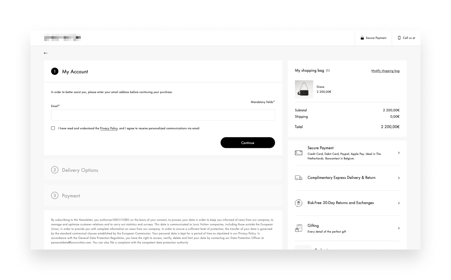
Complex Checkout Process
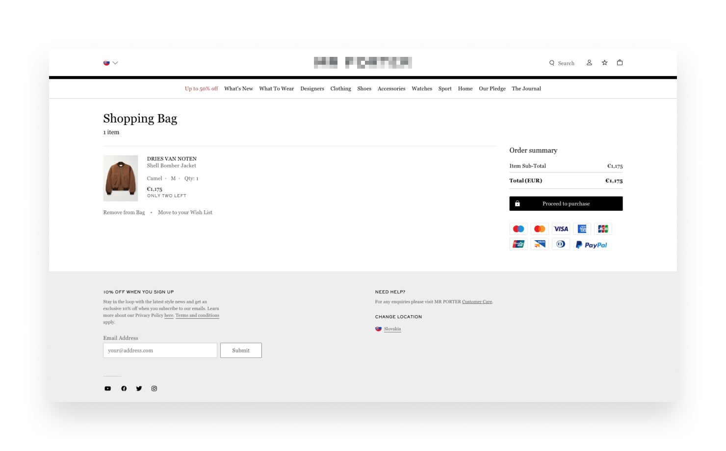
One of the biggest UX mistakes is having too complex a checkout process. Customers want to buy products quickly and without stress. If the checkout process is too long or too complicated, they may abandon their cart and leave the website. To fix this, just simplify the checkout process. Try to minimize the number of steps to as few as possible. For example, one-page checkouts are very popular, simply because they are fast. Don’t request too much personal information. Additionally, provides many payment options, including credit cards and others. Make sure that the interface is user-friendly, it contains explicit instructions that are easy to interpret, reducing any ambiguity that would cause customers to struggle to understand what they are required to do.
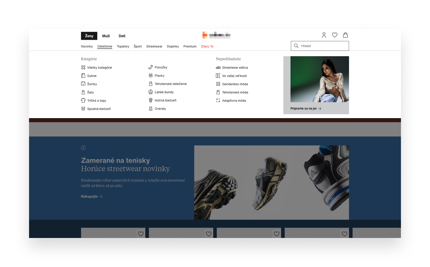
Confusing Navigation
Clear navigation is essential on any website, but particularly on e-commerce websites. Customers want and need to be able to find what they want very quickly and easily. If navigation is confusing, they will leave the site. To increase the ease of navigation, implement a logical menu structure. Organize products into clear categories and subcategories. Avoid excessive categorizations. Have a prominently placed and well-functioning search bar, enabling the customers to easily locate specific products. In addition, you can use filters and sorting options to further enhance the user experience in locating the products they need.
Broken Mobile Optimization
As mobile devices have become the go-to device for online shopping, poor mobile optimization can hurt any e-commerce website. A broken mobile experience will leave potential customers frustrated and most probably they’ll leave your website. You should do everything to avoid that. Make sure the website is responsive and able to be displayed correctly on different screen sizes. The design should look good on any device. Optimize images and content for mobile, so it’s easy to read also on small screens. In addition, make navigation easy for mobile users. Use large buttons and simple menus. Don't make users tap too much with excessive depth just to find what they want.
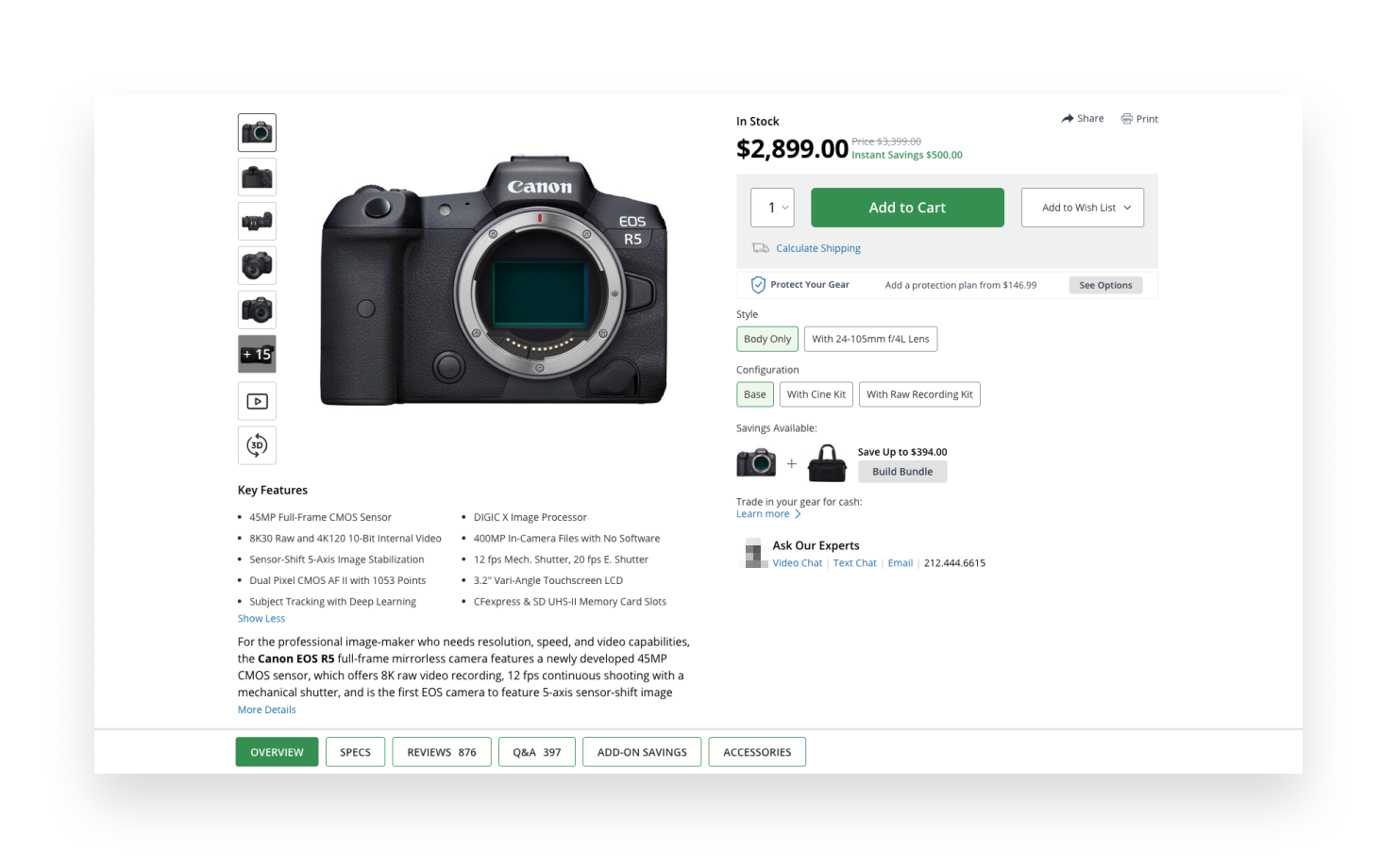
Insufficient Product Information
Customers need enough information about the product to make a purchase. They wouldn't buy a product if the product description is too short or doesn’t give enough details. To improve this, provide a product description with features, specifications, materials, and usage. Images should be high-quality to let customers see what they are buying. If possible, display products in a 360° view and allow zooming in for a closer look to maximize the experience. Finally, adding customer reviews and ratings can build trust and assist other customers in making decisions.
Lack of Trust Signals
Generally, trust and security are essential aspects of any e-commerce website. When entering personal or payment information, customers should feel safe and secure. If your site doesn’t look trustworthy, customers won’t purchase from it. To build up trust, display security badges, like SSL certificates, and secure payment icons. You should also have clear contact information like phone numbers, email addresses, and physical addresses to make it easy for customers to contact you. In addition, make sure that all your return, shipping, and privacy policies are clear and easily accessible.
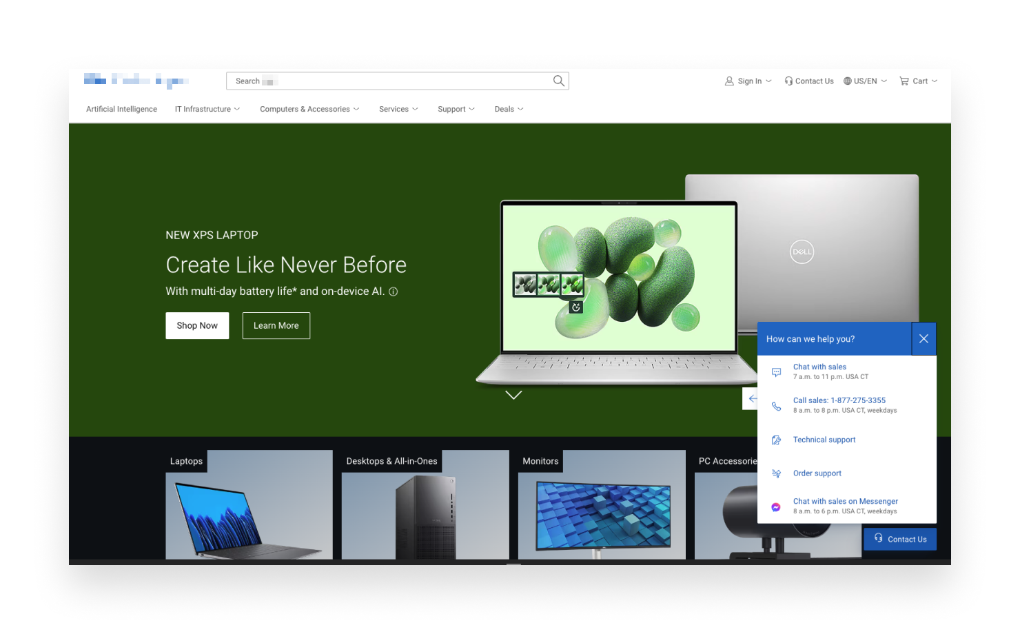
Poor Customer Support Options
Effective customer support that can help address issues and answer questions promptly will go a long way. If customers are not able to find any form of help when they need it, it will lead them to exit the purchase. Therefore, enhance customer support with several contact points: live chat, email, and phone support. Make your support team responsive and knowledgeable. If possible, also include a very detailed FAQ on your website so that most users will find their answers and will not need direct support from you.
Slow Page Loading Times
Nothing kills user experience and encourages a rise in bounce rate as much as slow loading times. As a rule of thumb, web pages should load as fast as possible since potential customers may quit a web page if the time it takes to load is too long. Imagery and other media on the website should be optimized in a way that reduces the size but still maintains quality. Use efficient coding practices for optimal content delivery. Periodic evaluation of the performance of the website and addressing any issues found will enable your website to maintain optimal loading speed.
Non-Intuitive Interface
Designing an intuitive interface is important. An intuitive design makes sure that users can navigate easily and find what they need without confusion. A design that is not intuitive, on the other hand, can frustrate users and chase them away. The way to develop an intuitive design is through learning and following already-established design principles and guidelines for designing with a user-first philosophy. Make use of consistent elements in your design, such as buttons, fonts, and colors, to bring in a unified look. You can also test your design on some users and get insights for change from actual real user experiences.
Hidden Costs
Cart abandonment can occur due to unexpected fees and charges. In other words, customers don't like surprises when it comes to pricing. Hidden fees destroy trust. To avoid this, be as transparent as you can about all the costs involved in a transaction. Make the checkout process clear, show the shipping fees, show the taxes, and show any other extra charges. Having an order summary with all costs included before the final purchase will enable the customer to know exactly how much they are spending, therefore reducing cart abandonment.
Insufficient Payment Options
Having limited payment options can limit potential customers who would like to use other means. Not all customers prefer the same method of payment, and some may abandon the checkout process if their preferred payment method is not there. The solution is to provide multiple payment options, including credit and debit cards, digital wallets, and alternative payment methods that are popular in different regions (e.g. PayPal). This flexibility will target a greater audience and lessen the chances of a sale being lost because of this reason.
Conclusion
A good UX is the key to the e-commerce website success. You can avoid these common mistakes and using our tips make the user experience better. Simplify your checkout process, improve navigation, optimize for mobile, provide detailed product information, assure trust and security, offer effective customer support, be transparent with fees, offer multiple payment options, and load your site quickly. By focusing on these areas, you can make your customers happy and increase your sales.


Kontaktujte nás:
Vyplňte formulár alebo nám pošlite e-mail. V prípade, že sa bojíte o svoj nápad, pošleme vám dohodu o mlčanlivosti a ochrane dôverných informácií a váš nápad bude v bezpečí.