The Evolution of Our Brand Identity: Why and How?

It didn’t happen overnight. We've had the modernization of our brand identity on the table for quite some time because we recognized that our company is evolving, progressing, and growing. Just as we adapt our communication to this growth, we knew we also had to adjust the visual aspects of our communication and the entire brand. It’s a natural evolution that is happening, and we have to embrace it in every way.
Brand Evolution vs. Brand Revolution
To begin, explaining the difference between evolution and revolution is important.
Brand evolution represents a gradual and continuous process of improving the brand. It takes place over a longer period to adapt to new trends or customer and market preferences, all without disrupting the core identity of the brand, which remains essentially consistent. Brand evolution is a natural outcome of a company’s development, gradually transforming to a new level, with the brand’s communication and appearance evolving slowly alongside it.
Brand revolution, conversely, signifies a radical change to the brand. This involves a major rebranding, typically undertaken when a company faces challenges and wants to "start with a clean slate”.
Why Did We Start the Evolution?
We, too, reached a point where we’ve been strengthening our position in the Slovak market, where we already have a solid foundation and partnerships with clients. Concurrently, we're establishing a strong presence in the U.S. market, successfully launching new projects, developing our existing partnerships, and expanding our overall presence. We're honored that our dedication is being acknowledged internationally and that they trust our capabilities—or rather, we can prove that we undoubtedly have the skills and experience right here at home.
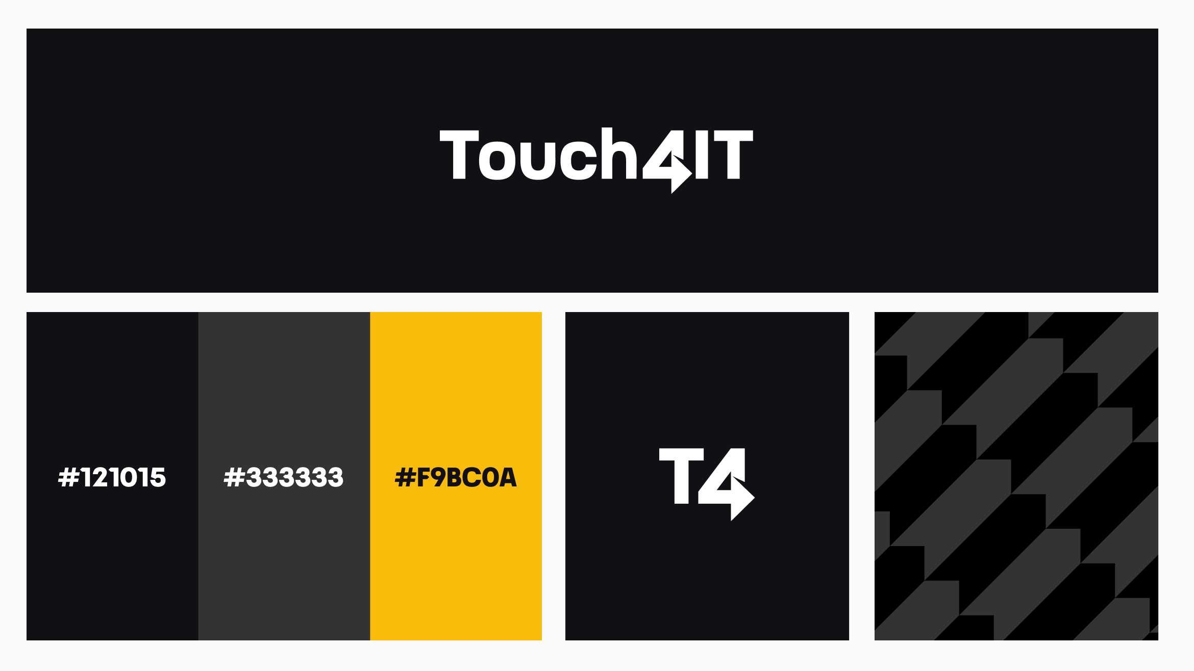
As the company evolved, so did the categorization of our services, allowing us to better highlight and present our added value and expertise. Our external communication gradually transformed, and so did our brand, which we wanted to elevate, refine, and modernize visually. Since we’ve always aimed to stick to our primary black-and-white color scheme, it occurred to us that we could enhance our identity with a custom font—something that would put the finishing touch on everything and say, "This is Touch4IT."
Brand Evolution at Its Core
When we decided to rebrand, we sought a partner with expertise in the field. GoBigname was the ideal choice. Through collaborative meetings, regular communication, and feedback sessions, we developed a brand identity with a refreshed logo, a defined color palette (including a tertiary 10% accent color), an arrow element, and an arrow pattern.
Why the Arrow?
This is an evolution of our core identity, which has been the cornerstone of our growth. The arrow in our "4" logo has been there from the very beginning, symbolizing our drive and ambition to move forward. It reflects our dedication to making decisive and purposeful strides forward. Our goal is not only to achieve our own growth and progress but to bring this same growth and progress to our clients. Through the digital products we design and create for them, we aim to help them develop, evolve their industries, embrace digital transformation, and move forward—following the arrow.
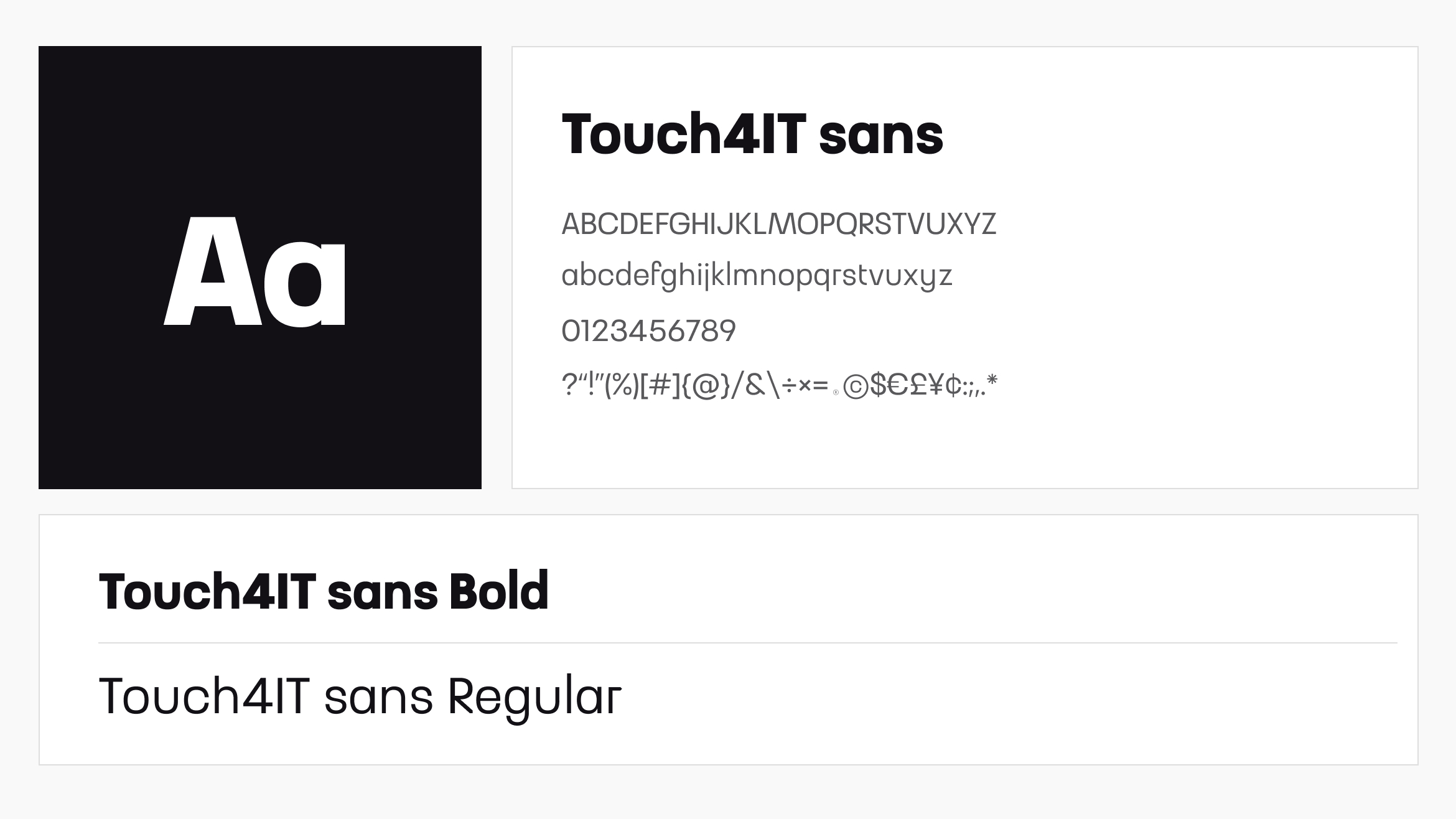
Our Own Style, Our Own Font
As we mentioned earlier, we’ve been toying with the idea of having a custom font for some time, and now we felt it was the perfect moment. Collaborating with the renowned Rudo Letko from GoBigname, we embarked on a creative journey. We created our very own “Touch4IT Sans” font. The goal wasn’t just to "have something unique"; it naturally emerged from all these years of our black-and-white identity, during which we often played with words and letters to create our distinctive style. This new font, rooted in minimalism, a tech-driven mindset, and the company’s progress, reflects our character perfectly.
Touch4IT = T4
Until now, you’ve known us officially as Touch4IT (of course 😊), and some of our visuals were marked with just our "4." Although you'll still know us as Touch4IT, we've introduced "T4" (read as "tee-four") as a secondary identifier. We introduced "T4" to address the occasional difficulty in reading our full name. Over time, the "T4" label started to emerge organically in internal discussions and documents, so as part of our brand evolution, we made this clear and intentional step forward.
Behind the Scenes: What Does Our Team Think of the New Identity?
We unveiled the brand evolution internally a week before the public launch, having already discussed its importance and meaning with the team. During this time, we walked through everything together as a team, showing and discussing the changes to ensure we were all aligned.
"The new visual identity beautifully reflects our vision and the direction we’re heading as a company. It’s modern, dynamic, and strengthens our market position while preserving the clear identity on which we’ve built our success."
— Matej Mihalech, Founder & Executive Director
"It looks great and truly captures who we are as a company. The visual is modern, eye-catching, and gives us a fresh look that will help us stand out even more."
— Mirka Prváková, Head of People
"I like that it has a ‘tech feeling,’ so it’s clear from the identity alone that we’re a tech company."
— Peter Takáč, BI & AI Team Leader
In Conclusion: Enjoy Our Launch Video


Kontaktujte nás:
Vyplňte formulár alebo nám pošlite e-mail. V prípade, že sa bojíte o svoj nápad, pošleme vám dohodu o mlčanlivosti a ochrane dôverných informácií a váš nápad bude v bezpečí.